
Prior to joining the team, HSA’s website used to have two different experiences for clinical pharmacists (CPs) and infection preventionists (IPs). It underwent a design overhaul that combined the workflows of clinical pharmacists and IPs into one experience, with the first major release focusing on the pharmacist workflow.
This change removed relevant workflows that the IPs relied on for patient documentation on hospital acquired infections (HAIs).
I led the iterative design of the alerts and reports page, so our customers can spend less time navigating the page looking for relevant data, and instead focus on taking action with their patient list.


The patient data is now scattered throughout the page or is hidden behind more clicks, which
adds time to their already busy schedule
increases customer support calls
hinders conversion to updated site


+20% conversion to new HSA
BUSINESS OUTCOME
More hospitals upgrading brings us closer to sunsetting legacy HSA
Increase efficiency
PRODUCT OUTCOME
Reduce time it takes to finish patient documentation
Improve UX maturity
UX GOAL
Push UX ahead of dev sprints, so we can provide better solutions
“I do not like the new views; It’s confusing to get to where I need to be and load what I need to load. I prefer the previous version.”
Due to time constraints, we opted to review post-release surveys to gauge user satisfaction and better understand which features caused the most friction. We found that users are having trouble navigating the new reports and alerts pages because:
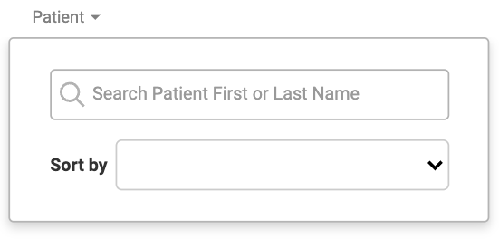
Not all data types can be filtered for
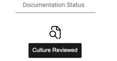
They cannot tell which cultures have been reviewed for a patient
There is too much information that dilutes the listing
Some of the new list actions leads users to the wrong path
To get an insight on what users did like, we collaborated with customer support and our subject matter experts (SMEs). SMEs know our application inside and out because they were IPs in a previous role.
From these interviews, we concluded that the legacy version was favorable because:

Data columns were straightforward with one kind of listing per cell
Filtering was easy, with a sort function per column
There was date range filter for culture collection/results
"Purple + signs" were a signal for "needs documentation" (see image on left)
Since we had a week to conduct research, our HFE and I decided to take on an A/B testing approach where we would show users three different prototypes that address user pain points that were also discussed with our PM.
We provided tasked-based scenarios for each feature we wanted to test and compared which of the designs had the higher success rate. This was also a way for us to get user feedback on the PM's suggested designs to showcase why it's important to conduct research on the ideal solution.
For each feature below, #2 performed the best and users completed these tasks with no issues.
Date range filter existed in legacy HSA and was a necessary feature that greatly increased documentation efficiency.


Currently, users had to scroll endlessly to find specific patients


Currently, users had to open up a separate module for each patient to see if the patient needed documentation


Although the above designs performed well, not everything goes as planned. Design 2 was well loved by the users because it resembled the legacy icons. However, once shipped, I saw an increase in customer support inquiries that I needed to investigate.
Since the icons I designed were new, I worked with our lead designer and requirements engineer to make sure the icons were accessible and authorized for the tool. We concluded that it was best to unify the icons by using one document symbol.
Having such a unified icon design confused IPs because they could not differentiate document types as easily.
As a result, these icons were rolled back immediately for further revision.
We conducted another round of usability testing where we focused on addressing the documentation icon. The design on the left worked well because users can tell if a culture needs documentation and they are able to view existing documentations easily through the accession number.


As part of an effort to collaborate more with the development team, I also incorporated a hand-off system that provides developers with hi-fi flows and redlines. This ensures that HSA is up-to-date with our design system and is part of a larger effort to unify BD's multiple medical products.

+35% conversion to HSA
BUSINESS OUTCOME
The updated UI better addressed user needs which led to more hospitals migrating to the new site
30% increased efficiency
PRODUCT OUTCOME
Users spend less time looking for necessary information in alerts and reports page with an improved UI
Design processes implented
UX GOAL
UX team is 2 sprints ahead where we have time to conduct research and finalize designs
At the end, we were able to produce something that was delightful for our users. It was a challenge struggling with the timelines we were given, while also juggling how we can change the current system. As this was one of the first projects I worked on with this company, I felt like I should make sure all stakeholders are satisfied. This led to me designing solutions that I know as a designer were not ideal. In the future, I’ll be more confident in my designs and push back because I conducted research to validate my proposed solutions.
It's also important to communicate early with stakeholders and agree on technical constraints and priorities. I learned to adapt to what the development team needed and we were able to create a hand-off process that was efficient.